Niet erin trappen
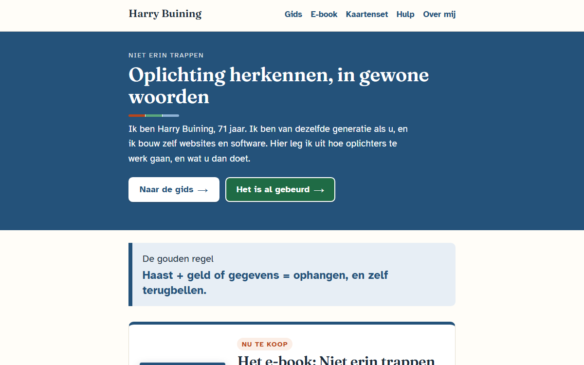
"Don't fall for it": recognising scams, in plain words. A website, an e-book and a card set for people of my own generation — written and built by me, at 71.
About the project
Scammers are getting better. A voice can be cloned, a fake email no longer has spelling mistakes, and a caller can put the real number of your bank on your screen. In October 2026 I received a neat email about a five-euro invoice, from a company I really am a customer of. And a call from a computer voice "from the bank", at a bank where I don't even have an account.
I'm 71 and build websites and software every day. I know how the technology works, and I know how these messages land with people my age. So I explained it the way I would want to read it myself: calmly, without jargon, and with what to do next. Everything is in Dutch.
What I made
- harrybuining.nl — for each type of scam, what you see and what you do, what to do if it has already happened, and where to get help. Live since 14 October 2026.
- The e-book Niet erin trappen — twelve chapters and two appendices, with examples of fake messages. On sale at bol for € 5.99.
- The card set — nine postcard-sized cards: on the front what you see, on the back what you do. The last card is one you fill in together with your family. The set is designed and print-ready; whether it gets printed depends on demand. The site has a waiting list.
Examples you can point at
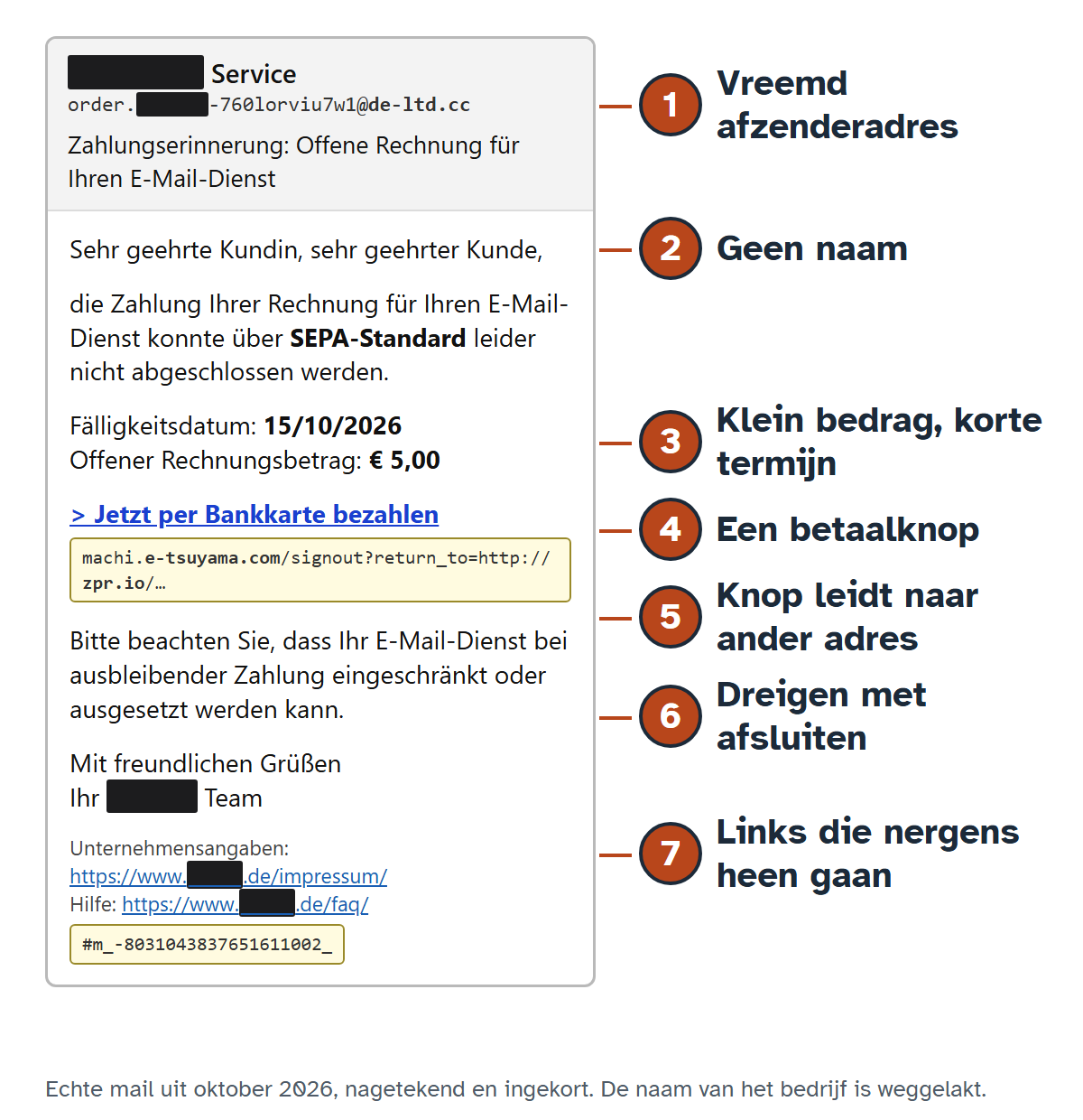
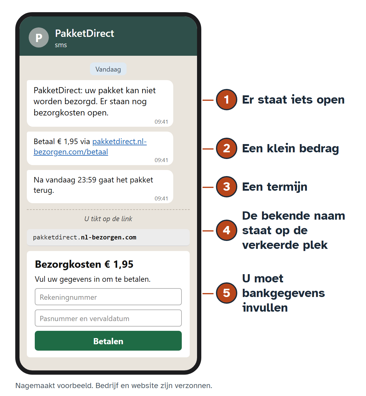
"Watch out for suspicious messages" helps nobody. So every chapter has a redrawn message with numbered features that match the list in the text exactly. One of them is my own five-euro email: with the address the pay button really led to, and links to the company that went nowhere.
Accessible, for real readers
- The Atkinson Hyperlegible typeface, designed for people with low vision — on the site, the cards and in the PDF of the book
- Large type, clear buttons and short sentences
- A description with every image for people who have the text read aloud
- The example images are also readable on a black-and-white e-reader
- No cookies and no tracking scripts: nothing to click away before you can read
Technology
The site is plain HTML and CSS on my own server, with the typeface self-hosted. I write the e-book in Markdown. My own Node scripts, without a single external dependency, turn that into an EPUB 3 and an A5 PDF from the same source, so the two never drift apart. I draw the example images as HTML and convert them to images with Edge; that way the numbers always sit at the right height.
Need something like this?
Want a site that also works well for older visitors, or for people with low vision? Book a free intake and we'll look at what's possible together.